

Pay page branding
View inherited branding or customise the Payment Page for your organisation in the Merchant Portal.
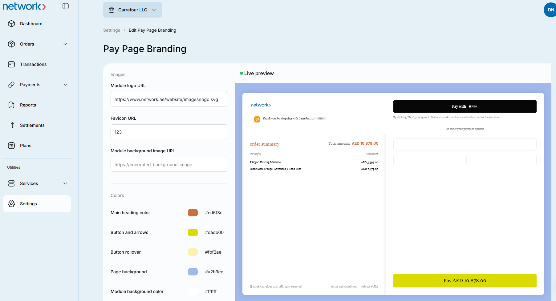
Only Merchant Admin Users can view the Pay Page screen.
The Portal’s branding is set at startup, and cannot be changed except for the Payment Page. The system comes with a Payment Page style installed, and if you want to keep the default style, there is no need to do anything.
Merchant Admin Users can however customise this style to better fit the Payment Page with their own website. If a Merchant Admin User changes a custom branding option, it will be set as the default for all children nodes, unless a Merchant Admin User changes that custom option for the child node.
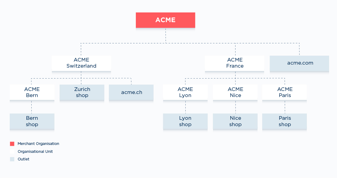
hierarchy graph
ExampleUsing the hierarchy graph above as an example; The “ACME” merchant organisation node sets the Pay Page’s Subheading font colour to pink at onboarding. So all nodes in the merchant organisation have that as their default Subheading font colour.
If a Merchant Admin User for the “ACME France” Unit node changes the Subheading font colour from pink to red, all its children nodes will have that as their default Subheading font colour.
But if a Merchant Admin User for the “ACME Paris” Unit node wants to, they can change their Subheading font colour from red to blue. Their children node (“Paris Shop” Outlet) will now have blue as its Subheading font colour. However, the “ACME Lyon” and “ACME Nice” nodes and their children nodes’ Subheading font colour will still be red.
Open Pay Page
- Select Settings from the top main menu. The Users page opens by default.
- Select Pay Page to open the Pay Page screen.
Edit branding
Use the Branding page to change the Payment Page’s style and fonts to match your website.
If a Merchant Admin User with higher permission changes a custom option, it will be set as the default style for all Users with less permission, if they don’t change that option. If they change that option, their choice will be set as the style for their Payment Page.
ExampleThe Germany (organisational unit) Admin User sets options of:
- “Module Logo; Acme Germany” (this is a URL)
- “Colours - Buttons and Arrows; Pink #D40E7D”
- “Colours - Background; Dark Pink #AF0B67”, and
- “Fonts - English: Body Copy; Georgia”.
The Germany Berlin (organisational unit) Admin User, who has less permission than the Germany Admin User, only sets the options of:- “Module Logo; Acme Berlin” (this is a URL), and
- “Colours - Background; Pale Green #73BF6A”
The Germany Berlin Payment Page will show the following options:- “Module Logo; Acme Berlin logo”
- “Colours - Buttons and Arrows; Pink #D40E7D”
- “Colours - Background; Pale Green #73BF6A” and
- “Fonts - English: Body Copy; Georgia”.
Portal branding cannot be customised.
Inherit branding
- Leave the Yes/No slide button in the Yes position, or move it to Yes to inherit the Payment Page branding.
- After viewing the branding, click Back or Pay page to return to the Pay Page screen. You do not need to edit or save custom branding.
A dark slide button is Yes  ; an empty slide button is No
  .
.
Apply your own branding
-
Move the Yes/No slide button to No, or click Edit / Apply your own branding at the bottom of the page. The Custom branding page for your organisation opens.
-
Optionally enter URLs for a module logo and background image. The logo sits on top of the background image. Use a valid image URL, not a minified or archived URL from services such as TinyURL or the Wayback Machine.
The logo must be PNG; the background image can be PNG or JPG. PNG supports transparency. The recommended logo aspect ratio is 5:2, with a maximum usable size of 640 × 256 pixels. The recommended background-image aspect ratio is 871:200, with a maximum usable size of 1 742 × 400 pixels.
-
Enter a hex colour in Module background colour, H1 (Heading 1), Button and arrows, Button rollover and Page background, or click a colour sample to use the Colour Picker. The selected colour appears in the sample box beside the field. For picker instructions, see Optional: Use the Colour Picker.
-
Set Capitalise Text beside the English heading or subheading fields to the position you want. A dark slide button is Yes; an empty slide button is No.
-
Click the relevant Font field or Open arrow, then select a font from the dropdown. Repeat for each font you want to change.
-
Click Save. The Branding page displays your saved selections.
-
Click the
 Pay Page link at the top left to return to the Pay Page screen.
Optional: Use the Colour Picker
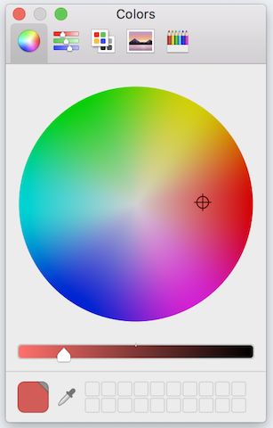
Note: This is the default Colour Picker for the Chrome browser. Depending on the browser used, this may vary in appearance, but the options will be the same or very similar.
Select a basic colour or enter HSL or RGB values
- To select a basic colour, click on the colour square you want from the Basic colour section. Go to step 3.
- To select a colour using number codes, type in the Hue/Saturation/Luminosity (lightness) or Red/Green/Blue number code for the colour you want, in the appropriate field.
- Click the OK button. The Colour Picker box closes.
The new colour displays in the colour square for the selected option.
Select a custom colour
- Click your cursor in the colour grid on the colour you want.
- Move the crosshairs cursor around the colour grid to change your selection.
The colour selected is displayed in the Colour/Solid box, and changes as the cursor is moved. - To change the shade (lightness/darkness) of the chosen colour, click on the arrow on the shade bar.
- Hold down the left mouse button and move the arrow up and down until the Colour/Solid box displays the shade of the colour you want.
- Click on the Add to Custom Colours button. The colour is saved to the Custom Colours section.
- Click the OK button. The Colour Picker box closes.
The new colour displays in the colour square for the selected option.
Updated 1 day ago